Getting some research in for my postcard early on. When I look up film festival postcard examples 90% are other media projects while 9% are templates, I'm avoiding analyzing either.
URBANIA:
The front of Urbania's postcard is super engaging, especially the emphasized image surrounded by a full black background. The title's red and huge text also emphasize it, making it eye-catching and clear that it is the title. I like the tagline placed right under the title, although I know it's not a requirement, it continues to advertise the film in a simple way. If I were to include a tagline in mine, I have to make sure its role as a tagline is apparent through its position to the title and to avoid it taking up too much space. The postcard also includes a quote of a review and production credits, neither of which will be included in mine, but the age-rating and festival it is being shown in also seem interesting to me, I might include both when making mine. Which film festival it is being shown in will be included regardless, but I'm curious if I should include it in the front, back, or both. Just something to keep in mind when developing it.The back of Urbania's postcard is much, much less engaging than the front. It's blank. The only things that represent the film is the bold title on the top left. I do like how the text is formatted, though. Having the names be all caps while their role is in standard capitalization is cool, like "A film by JON SHEAR." The back also has the branding of the postcard production company for some reason? At first I thought it related to the film but nope it's just the people who made the postcard. Urbania really failed on its back cover. It also has little lines on the bottom right that looks like people would write in, but I have no idea what they would even write there. Also where the film opens is super vague and not nearly as specific as it needs to be. "Opens Friday, September 8th in New York and Los Angeles" ??? Huh? Weird how the film festival isn't even mentioned here but it is on the front. I do like how the website is advertised and encourages audience interaction, "Hear any good stories lately? Share them at our website:" Overall, the postcard had some cool ideas I will definitely keep in mind when developing mine, but it really fell flat in a bunch of areas, especially the back.
WREN BOYS:
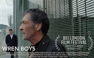
I was only able to find one side of a postcard for Wren Boys, there is other key art of the film but I'm not sure they are the back of the post-card. The image used for the post card isn't too bad, it features two characters and their faces and the composition paints an emptiness(?) between the two because of all the negative space. The title is large and apparent with the film festival it screened at also large and apparent. It does feature a hefty amount of production credits but that isn't necessary for mine. Honestly the card feels very empty, to me, it leaves a lot to be desired but that could have been intentional with the tone and themes of the film I'm not sure. Also the placement of the text feels off, there's a lot of empty space on the entire left side of the card, I think I would have placed the text there instead of on the bottom, I like how large the key art is though, especially in contrast to Urbania, Wren Boys' key art is to the point and just straight-up shows a shot of the film. I think I'll take inspiration from that and make my key art take up a majority of the card.


No comments:
Post a Comment